李公寓/InOrder工作室
LEE Residence / InOrder Studio
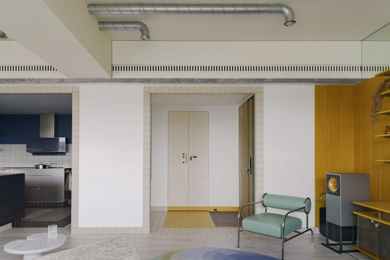
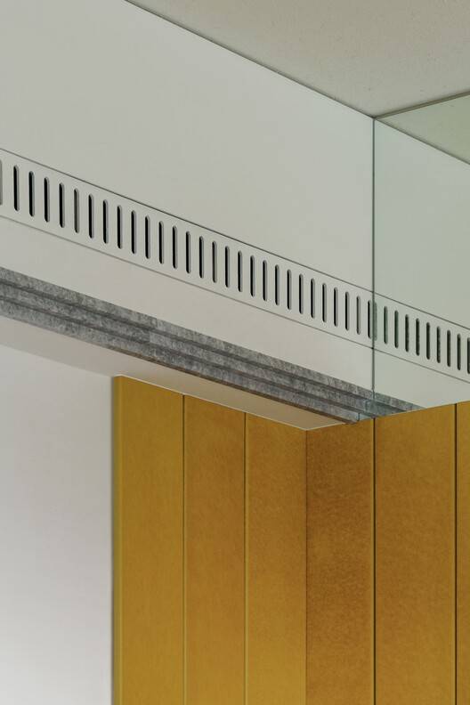
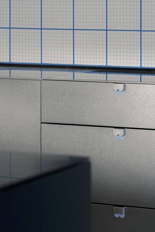
巧妙的家具陈列:该项目最大的亮点在于其对家具陈列的精心考量。设计师巧妙地将大量空间用于展示业主喜爱的家具,充分体现了对现代主义设计的深刻理解。通过选择“安静、不引人注目”的背景,巧妙地利用定制空调通风板、精心挑选的门把手、隐蔽的开关和精确对齐的瓷砖,强调了室内与家具之间令人愉悦的相互作用。这种对细节的关注,使得建筑和家具融为一体,形成和谐统一的空间,充分展现了设计的多样性与协调性。这种设计策略不仅注重实用性,更强调了视觉上的美感和空间的整体性。
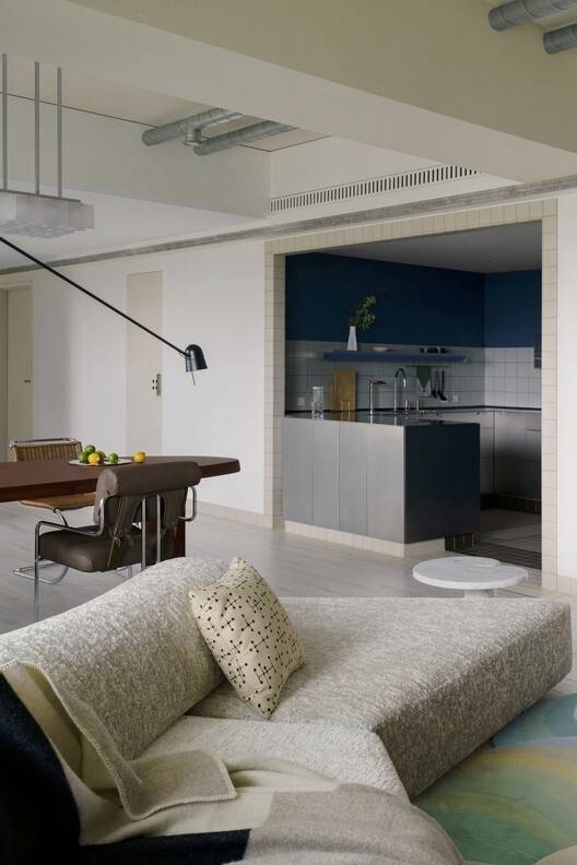
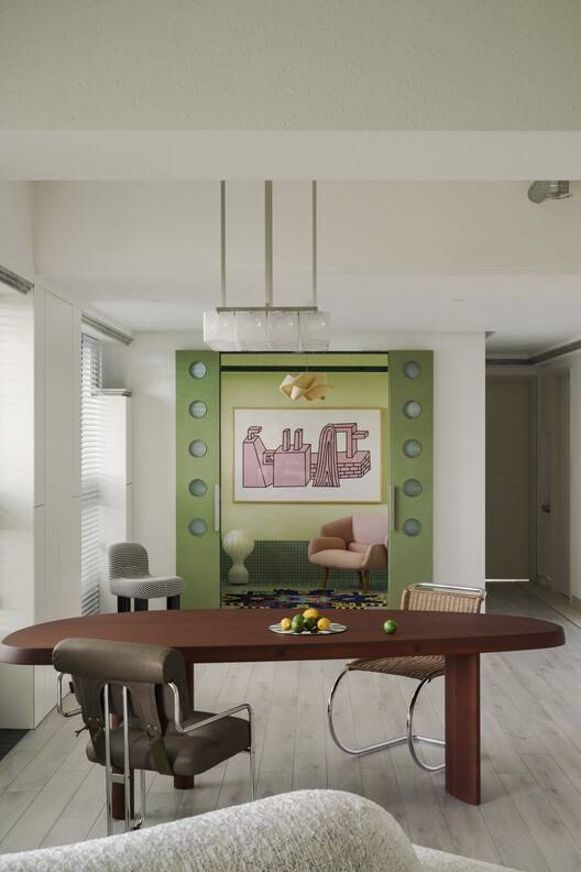
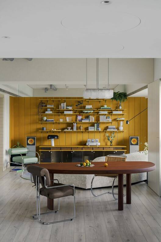
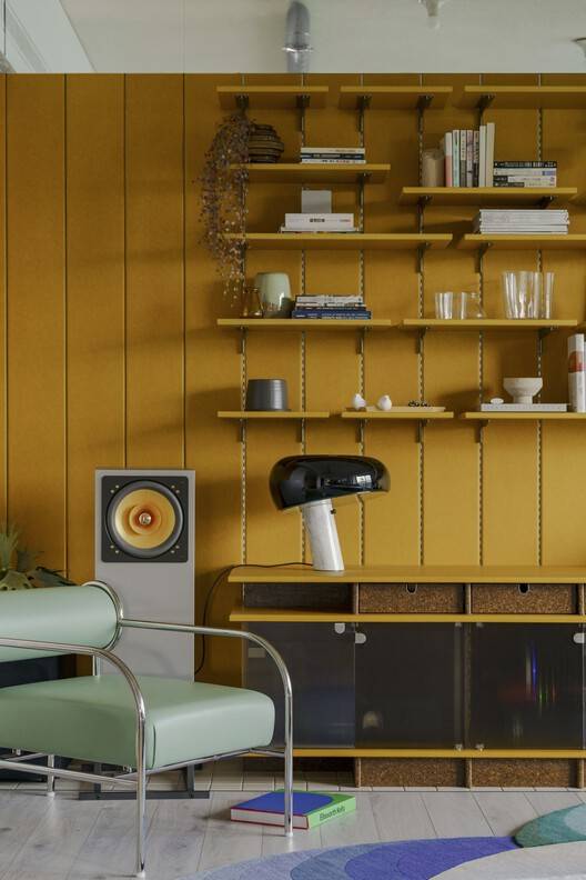
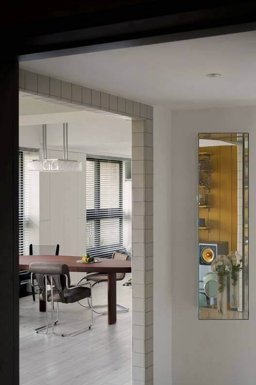
色彩的巧妙运用:项目在色彩运用上展现了高超的技巧。通过黄色、蓝色和绿色等主色调的巧妙运用,定义了客厅、厨房和书房等区域,使空间更具活力和个性。更重要的是,这些色彩并非孤立存在,而是与空间框架、家具形式和布局策略相结合,营造出一种和谐与平衡感。这种色彩的协调,不仅提升了空间的视觉效果,也反映了设计师对整体设计的深刻理解和掌控能力。这种对色彩的精准把握,为居住者创造了一个充满活力和色彩的居住环境,也体现了建筑设计对生活品质的贡献。
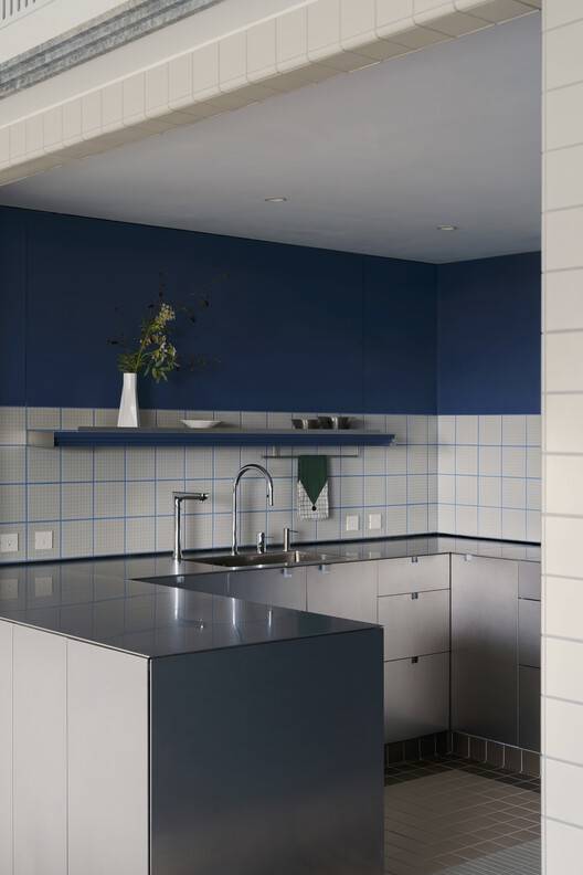
材料的精心选择:设计对材料的选择展现了精湛的专业素养。不锈钢折叠台面、防污瓷砖和桦木单板床头板等材料的选择,不仅仅是为了满足功能需求,更重要的是为了利用每个元素的独特特性和表现潜力。这种对材料的深入理解,使得设计真正成为“把正确的东西放在正确的地方”的艺术。材料的选择与应用,不仅提升了空间的美观度,也增强了空间的实用性。这种对材料的精心选择和运用,体现了设计师对细节的极致追求,以及对整体设计效果的掌控能力。
© studio vwp
© studio vwp
建筑师提供的文字描述Text description provided by the architects. Lee Residence is located in Taichung City and spans 45 pings (approximately 148.5 square meters). It is home to a couple who are passionate about post-1950 modernist design and deeply knowledgeable about furniture. Given their high-pressure professional lives, they sought a residence that would serve as a vibrant, colorful retreat—an oasis that rejuvenates both body and mind.
© studio vwp
很大一部分空间用于展示业主最喜欢的家具。因为家具的色调是如此多样化,所以在规划时非常谨慎,保持了一个“安静、不引人注目”的背景。因此,整个空间的许多细节都经过了精心设计:定制的空调通风板、精心挑选的门把手、隐蔽的开关和精确对齐的瓷砖都突显了室内与家具之间令人愉悦的相互作用。
A significant portion of the space is devoted to displaying the owners' favorite furniture pieces. Because the furniture palette is so diverse, the planning was approached with great care, maintaining a "quiet, unobtrusive" backdrop. As a result, many details throughout the space have been meticulously crafted: custom air-conditioning vent panels, carefully selected door handles, concealed switches, and precisely aligned tile work all highlight the delightful interplay between the interior and its furnishings.
© studio vwp
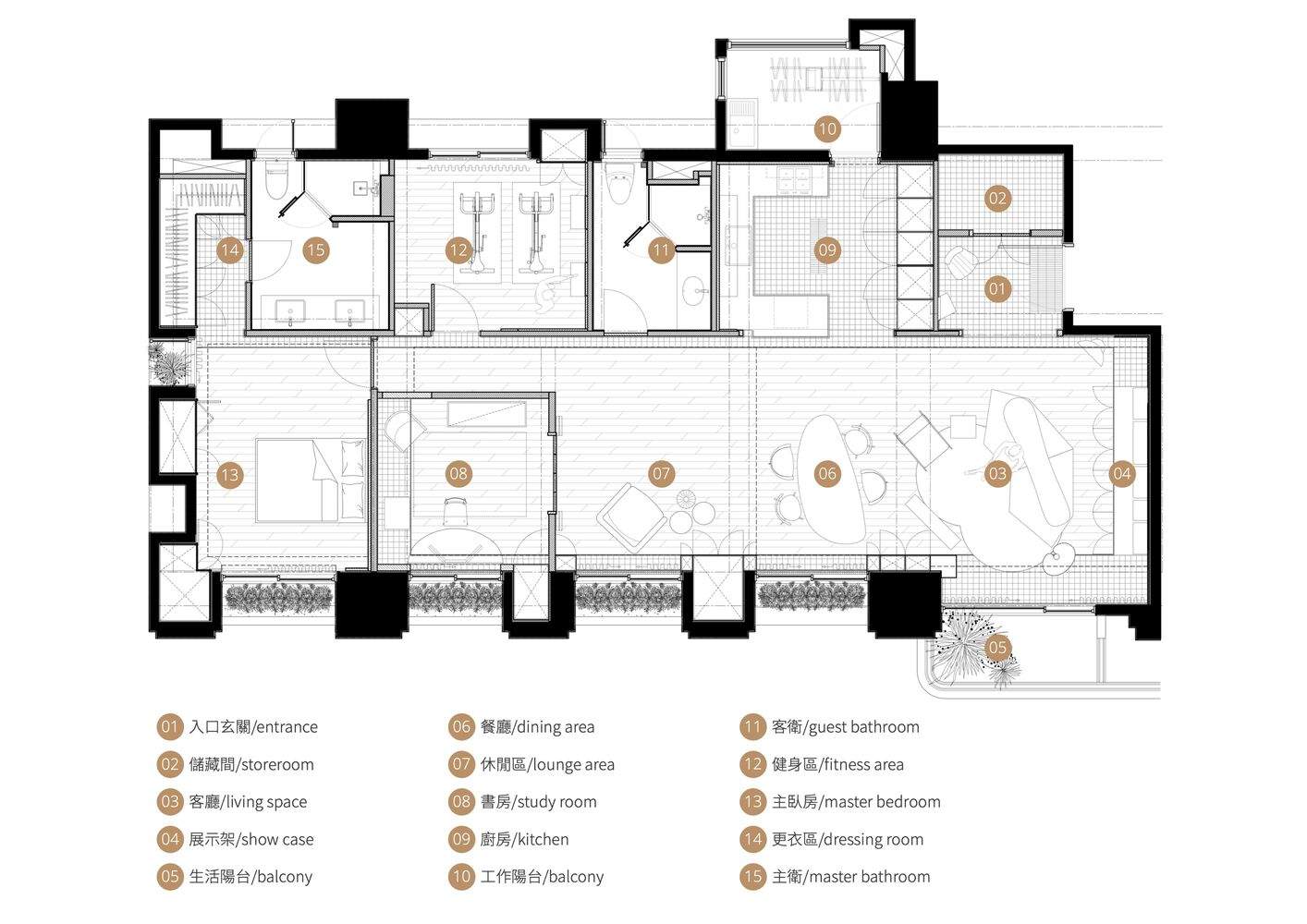
Plan
© studio vwp
© studio vwp
为了配合主人的主要家具,黄色、蓝色和绿色被选为主要色调。这些颜色有助于定义客厅、厨房和书房等区域。同时,在空间框架、家具形式和布局策略中,配色方案和设计细节都经过了深思熟虑的分层,培养了整体的和谐与平衡感。
To complement the owners' key furniture, yellow, blue, and green were chosen as the primary accent hues. These colors help define areas such as the living room, kitchen, and study. Meanwhile, both the color schemes and design details are thoughtfully layered within the spatial framework, furniture forms, and layout strategies, cultivating an overall sense of harmony and balance.
© studio vwp
© studio vwp
材料的选择是为了利用每个元素的独特特性和表现潜力:厨房里的不锈钢折叠台面、防污瓷砖和桦木单板床头板都展示了在这个项目中,设计是如何真正成为一种“把正确的东西放在正确的地方”的艺术
Material choices were made to harness each element's unique characteristics and expressive potential: the stainless-steel folded countertop in the kitchen, stain-resistant tiles, and a birch-veneer headboard all showcase how, in this project, design is truly an art of "putting the right things in the right place."
© studio vwp


